A while back, I watched a viral commercial about the French women’s World Cup team, and it’s a perfect segue into this week’s article. The whole premise of the commercial highlights how easily what you see may – or may not – translate into reality.
In the commercial, they superimposed men (and their ‘seemingly’ superhuman efforts) over the actual athletes – the French women. Eventually, they revealed the actual athletes.
This commercial encapsulates that it is far too easy to disguise your message to manipulate the viewer into believing whatever you want them to. And that’s no way to build trust with your prospects or to retain existing clients.
The success of your postcard campaign, not to mention establishing confidence in your target audience, begins with basic design and presentation guaranteed to ensure you stay true to your message. By accentuating the following simple components of postcard construction, you can drive up the believability percentage and more potential sales.
- Underlining – The first of the three tried & true methods of emphasizing your copy. It is an understated way of saying, “Hey, look at me” without yelling.
- Italics – Sometimes hard to pick out from the crowd; italics need to be used with the right font, and in the right way. If you can set a single word or phrase off by itself, it makes the italicizing easier to pick up on.
- Boldface – The last of the three standard methods, boldface is the easiest way to add texture and emotion to your copy. How often do you see ‘ SALE,” CLEARANCE,’ or ‘GRAND OPENING‘ in boldface? This enhancement goes hand-in-hand with the ‘All caps’ design element coming up next.

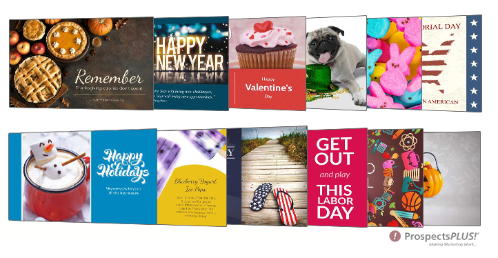
The Holiday scheduled campaign is shown above. To learn more, Click Here.
- All caps – In most forms of social media, this equates to YELLING at the reader. In postcards, we’re just trying to get your attention. Be careful about yelling.
- Indented paragraphs – Offsetting your typeface in a postcard isn’t always easy, since you don’t necessarily rely on standard sizing where text is concerned. You can, however, tab the first part of your paragraph to set a ‘starting boundary’ for your sentence. It’s down to preference, honestly.
- A combination of colors – Rarely, if ever these days, will you find a postcard in your mailbox that features a single color printed on postcard stock. In using too many colors, the danger is that you risk turning your promotion into a rainbow that distracts from your message. Don’t do that.
- Highlighting in yellow – Its classic presentation is undeniably hard to escape. ‘Highlighter yellow’ has an instant eye-grabbing effect, and can direct the reader’s attention practically anywhere on the postcard you want them to go. Highlighted copy is often read before anything else! As such, it can be used to position your first Call-to-Action and then entice the reader with the rest of your postcard!
- Handwritten notes in the margins – Naturally, that will take the form of a ‘handwriting’ font these days, but the effect is the same. Handwritten notes convey a sense of personalization, even when you can tell there’s nothing personal about it.
- Putting a key paragraph [or information block] in a box – Everybody loves a call-out box! Drop a highlighted, italicized phrase in all caps here for extra attention.
It isn’t always easy or obvious to tell when we’re being deceived. AI interference, slick and/or fraudulent imagery, and overly complicated word salads are all clowns in the circus of confusion some would use to attract new business.
There is no reason for anyone to resort to carnival tactics, or to engage in smokescreens to build a better mousetrap and market it. The viral commercial made it extremely clear that humans can create any kind of advertising, and that its deployment to the public (where not revealed to be authentic) can sometimes be dubious.
Please reach out to our customer service team at 833-875-8800 if there is anything we can do to help you succeed with your direct mail marketing.


